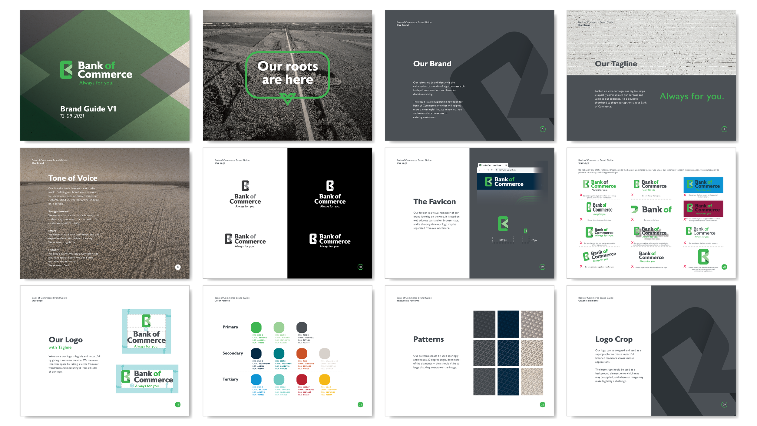
Bank of Commerce, based in Greenville, Mississippi, operating in the region since 1904, needed to differentiate itself in a community whose trust it had long earned. Part of the challenge in rebranding was, not only to retain its customers’ fierce loyalty, but also a name that is not particularly unique. And we had to keep the color green!
is over 120 years old, has a deep history and relationship with its community over 17 branches across the state. The only two client requests were to keep their name, and the color green, but their intention was to reflect in their new brand the modernization of their products and services.
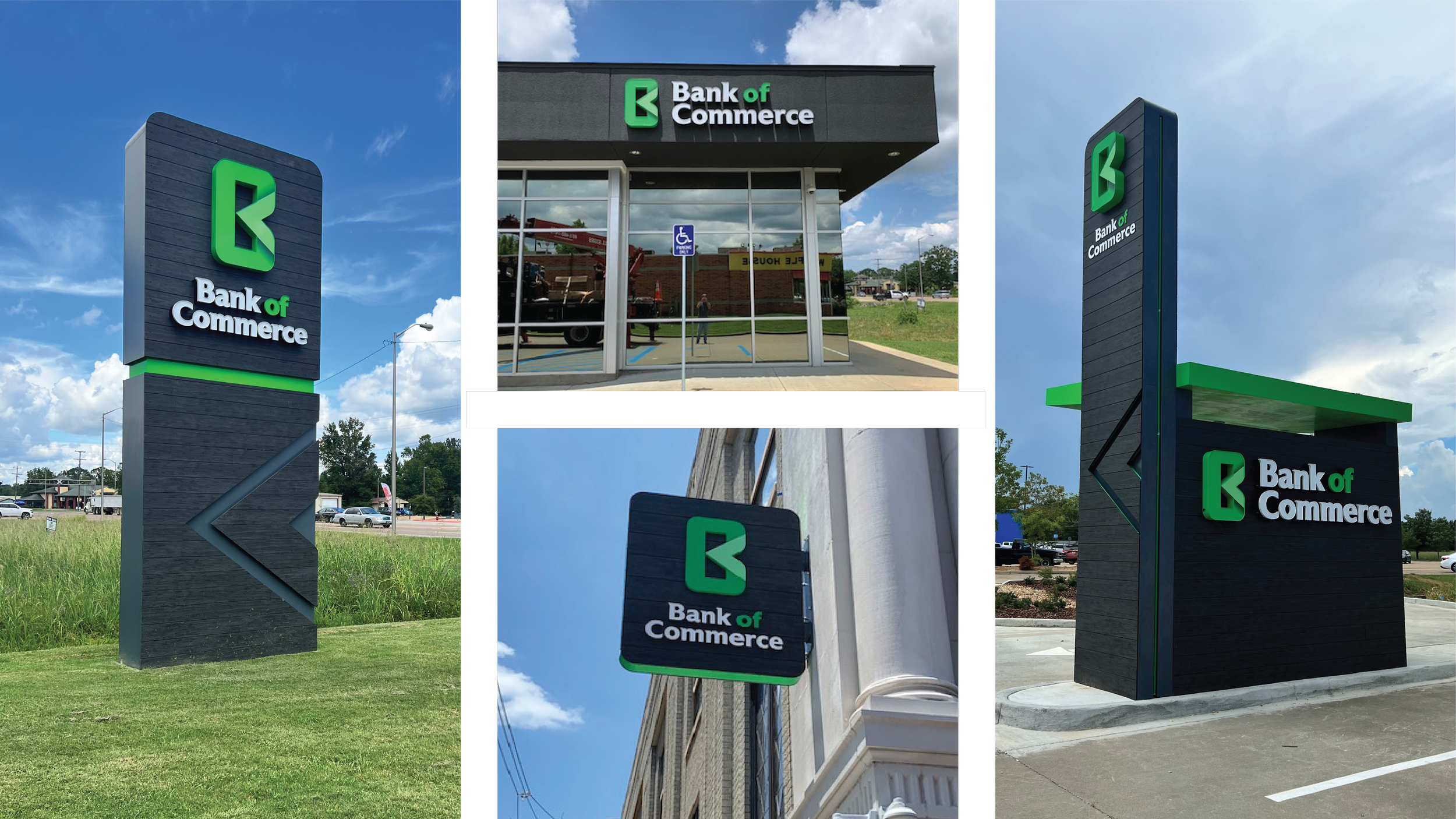
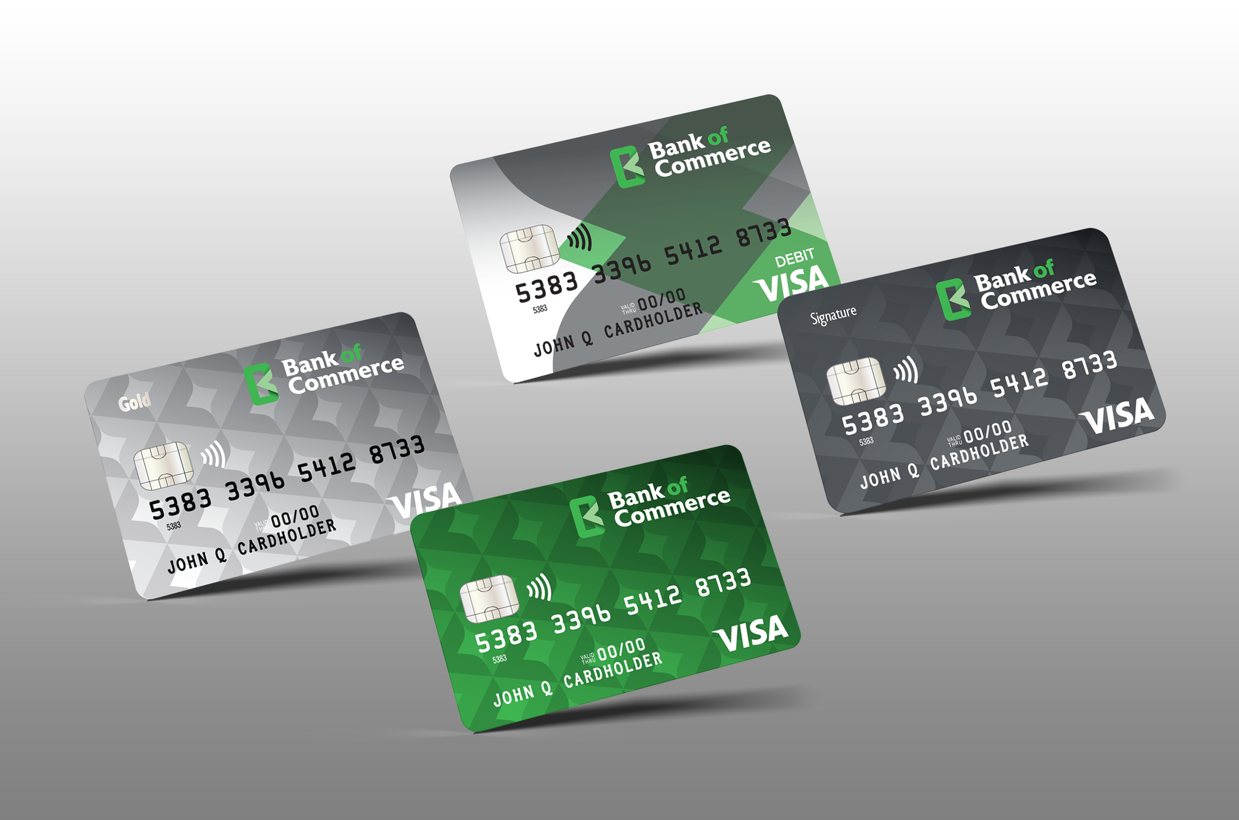
The new logo mark is a clean and modern monogram that includes the “B”, and the “C”, of their name, with an implied “O” in the negative space. The new brand system was then applied to every customer-facing point of contact: website, printed collateral, credit and debit cards, interior design, as well as exterior signage and newly designed drive-thru and ATM stations. The client has been very happy with their new brand, and has since expanded their coverage and footprint across Mississippi.
Creative Director: Will Agrella
Lead Design: Xavier Viñas
Copy Writer: Pamela Henman